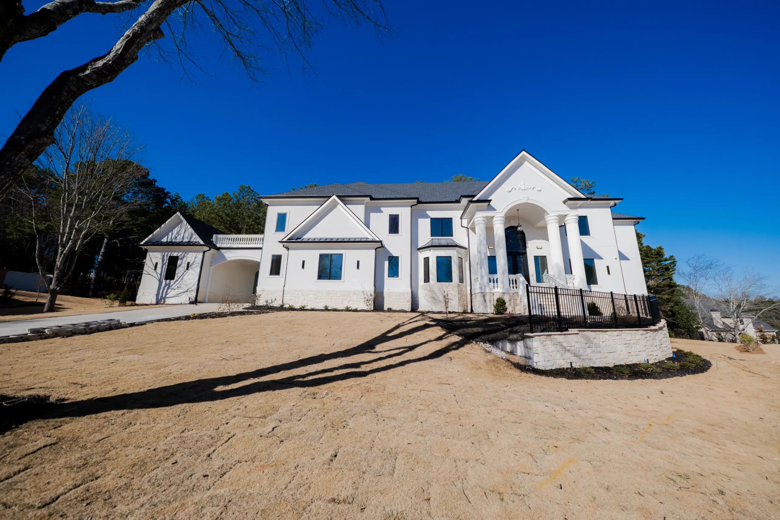
The most visually coherent homes are not the ones with the most materials — they are the ones built around the fewest. This St. Marlo custom home is anchored by three: white for the primary surfaces, matte black for the accent elements, and natural marble for the high-touch areas where warmth and texture matter most.
A design palette is not a color palette. It is a system of decisions about which materials appear where, in what proportion, and how they relate to each other across every room in the home. A palette that is not planned as a system produces homes that feel eclectic at best and incoherent at worst — each room looks fine in isolation, but none of them look like they belong in the same home. A palette that is planned as a system produces a home where every room reinforces every other room, and where the cumulative effect is greater than any individual space.
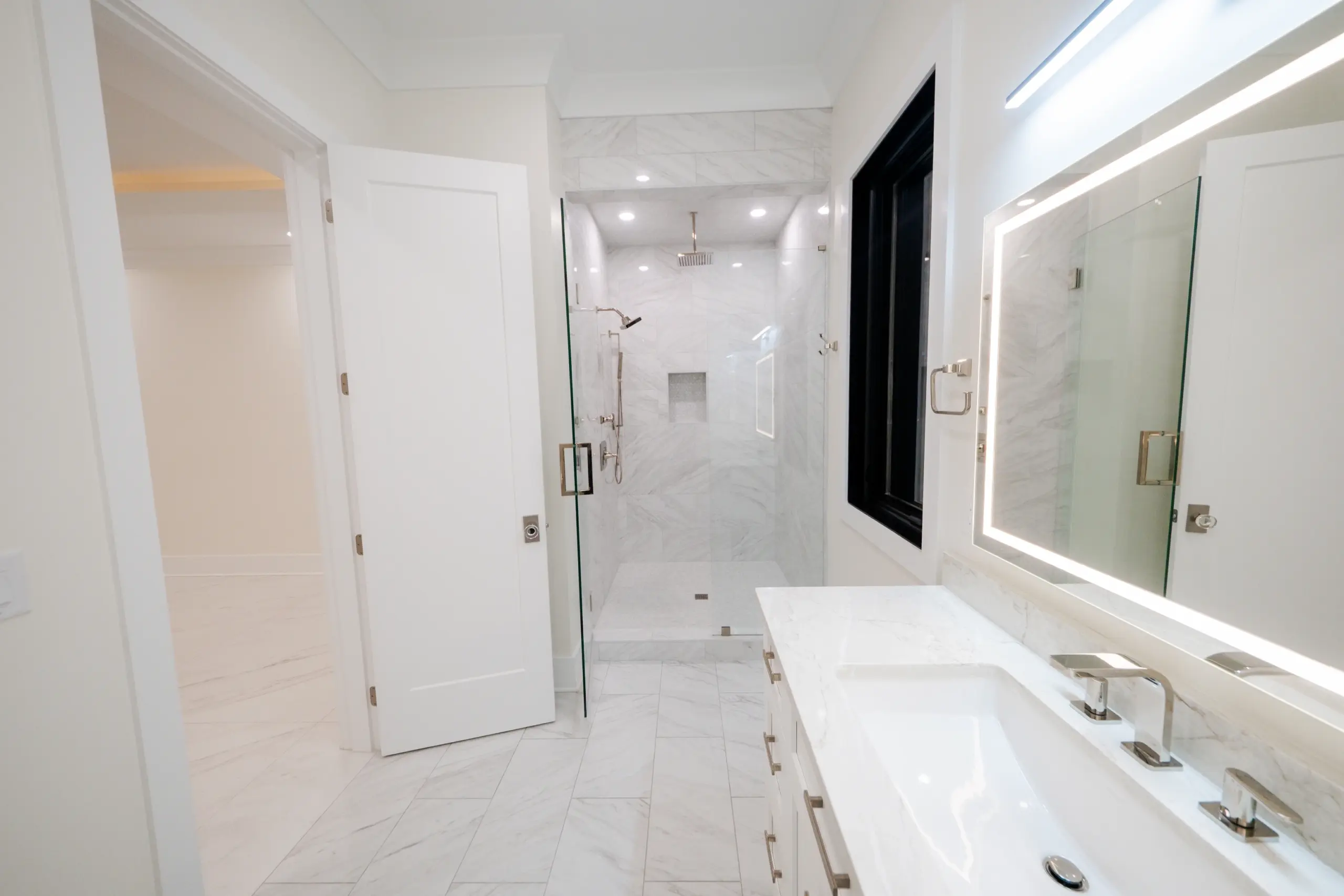
The white-black-marble palette in this St. Marlo home achieves that coherence. White establishes the primary surface in every space: the exterior siding, the interior walls, the cabinetry, the shower tile. Black provides the accent: the foyer chandelier, the staircase railings, the kitchen hardware, the ceiling fixture in the living room. Marble provides the warmth and texture: the kitchen countertops, the bathroom vanity, the shower walls. Three materials, every room, complete coherence.
White is not a default — it is a choice. In a home where the architectural elements are the primary design statement — the coffered ceiling, the two-story foyer volume, the geometric staircase railing — a strong wall color would compete with those elements rather than support them. White recedes and lets the architecture lead. It also provides the high-contrast backdrop that makes the black metal accents read as crisp and deliberate rather than dark and heavy.
On the exterior, white Hardie board siding serves the same purpose: it reads as clean and contemporary, allowing the gabled roofline and arched entry to define the facade’s character rather than the cladding color. In the kitchen, white cabinetry allows the Calacatta marble to carry the visual weight without color competition. In the bathrooms, white walls and tile make the marble countertops and chrome fixtures read as deliberate focal points.
“Three materials, consistently applied, produce a home that reads as a single designed object rather than a collection of rooms. The restraint is the point — and the restraint is harder to achieve than its simplicity suggests.”
Kitchen: white cabinetry and Calacatta marble countertop — the primary palette expressed in the home’s most-used room
The matte black accent finish appears in this home at every scale: the multi-ring spiral chandelier in the foyer, the staircase balusters and handrail, the cabinet hardware in the kitchen and bathrooms, the ceiling fixture in the living room. This repetition is not redundancy — it is continuity. Every time a person moves from one room to another, they encounter the same dark metal accent, and that consistency tells the eye that this is a home that was designed as a whole.
Matte black was chosen over polished black or satin nickel for a specific reason: matte black does not compete with the chrome fixtures in the bathrooms. The chrome faucets and shower hardware in the wet areas read as a separate finish category from the matte black structural elements — the railings, the fixtures, the cabinet pulls. The two finishes coexist without competing because they occupy different categories of element in each room.
Does a white-and-black interior palette date quickly?
No. White and black is one of the most enduring palettes in residential design — it appears in homes from every era and reads as contemporary in every decade. The risk of dating comes not from the palette itself but from the specific fixture profiles and hardware styles chosen within it. Clean, simple profiles age better than styles with heavy ornamentation or strong period references.
How do you prevent an all-white interior from feeling sterile?
The marble and natural materials in the palette do the work here. Marble’s natural veining, variation, and warmth prevents any white interior from reading as institutional. Texture, through tile patterns and cabinetry profiles, adds visual interest without color. And the black accents provide the contrast that keeps the white surfaces from reading as blank.
Serving Gwinnett, Forsyth, Hall, Fulton, and Cherokee County homeowners within 30 miles of Duluth, GA.
Request a ConsultationAtlantic Construction & Remodeling — custom luxury home design and build serving the north Atlanta metro within a 30-mile radius of Duluth, GA.